I have adapted the graphics from the last post to have a logarithmic progression in the size, so that an increase of consumption would not lead to the bars going off screen, while allowing to see small variations as well. So this was the result:
Not bad in my opinion, but I think it is a bit too difficult to read, partly due to the difficulty in adjusting the coefficients such as to have a nice variation range.
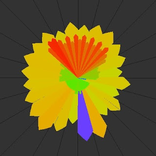
So I decided to make it constant width and only change the color:

I think this is a better display, although the colors aren't the best...must work on that. The red area was the washing machine centrifuging the clothes!
One other idea, would be to combine the electricity and gas in one sole graphic displaying the cost, e.g. in euro, or in CO2 emissions!
No comments:
Post a Comment